Liv Designs
A Kitchen and Great Room to Remember
Here’s a fun project from a few years back that we haven’t had a chance to talk about on the blog yet – so please indulge us while we brag for a few minutes here.
We worked with Alair Homes on this project, and as always, it was such a privilege to work with them. For those of you who are unfamiliar with Alair, well, shame on you. Ok, that was a bit harsh — no shaming here, but you definitely need to take the time to get to know them. Visit their website and follow them on social media to see all the fantastic work they are doing to custom build and renovate dream homes all over Utah. They are A-MAZ-ING! We absolutely love working with them, and we are reliving all the feels as we take a trip down memory lane, remembering this beautiful classic home with a modern edge.
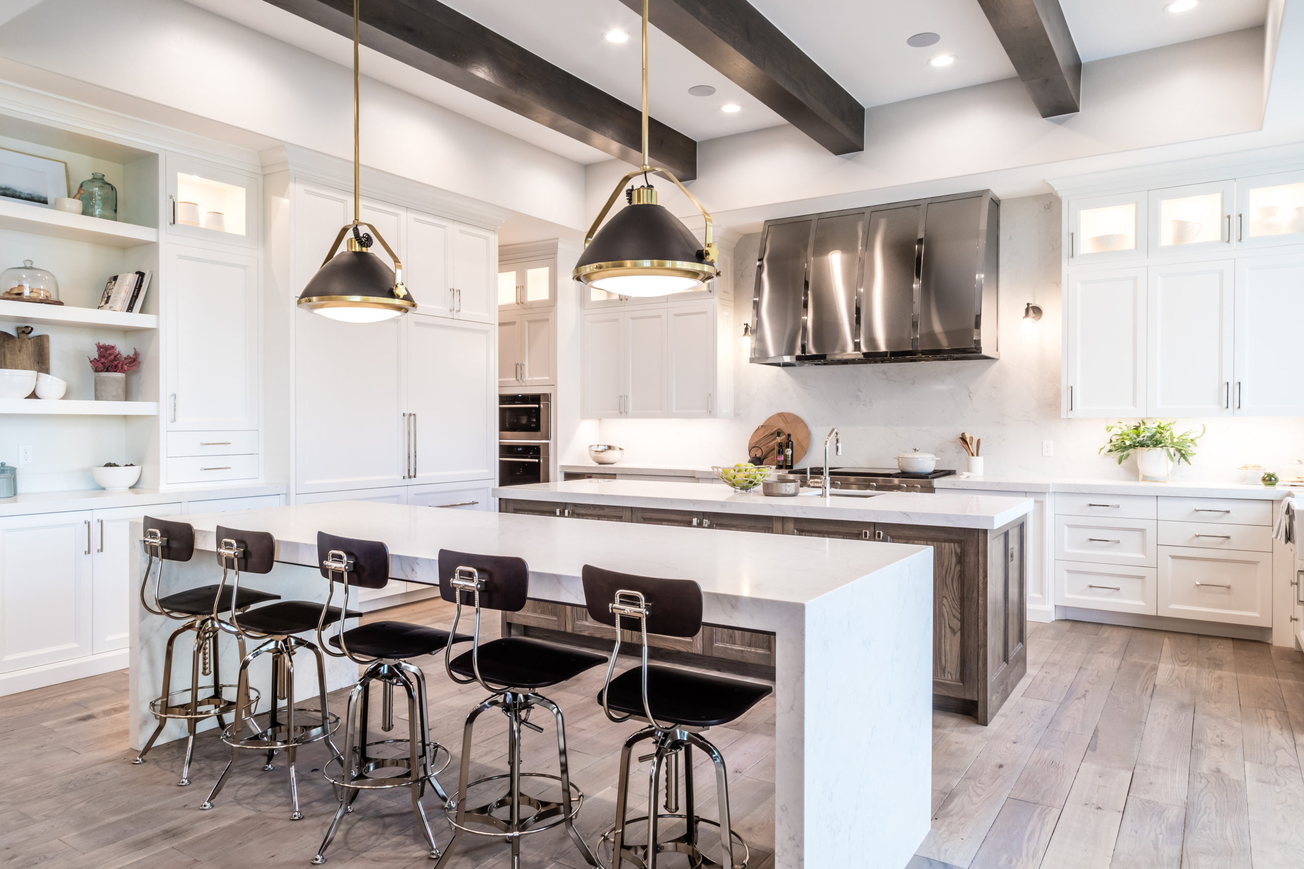
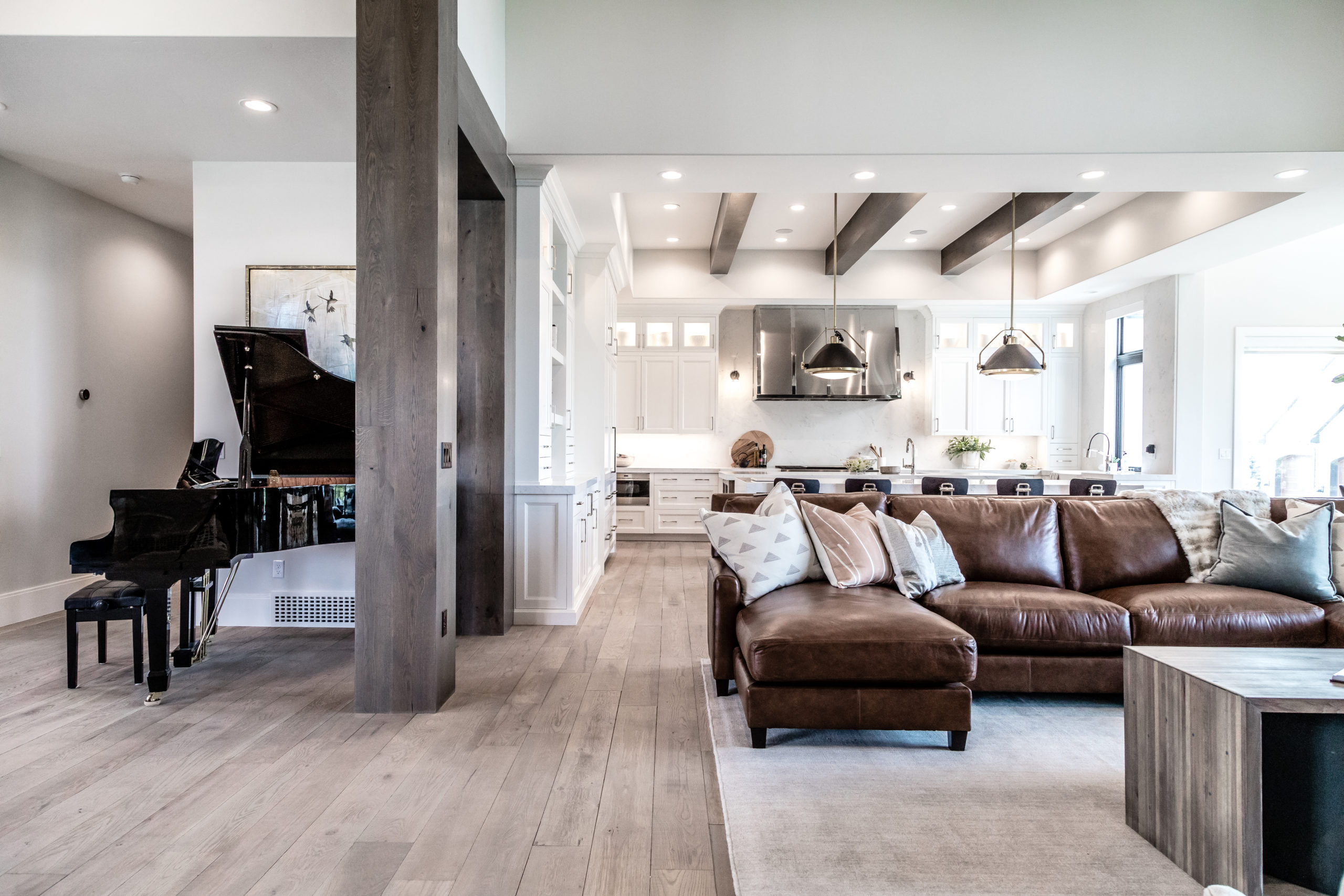
Now let’s move on into the kitchen. Take a moment and soak in all this stunning kitchen has to offer. Its simplicity and function are inspiring! The original design had 12-foot ceilings with cabinetry that went all the way up, but our design team wanted to bring the house back to human scale. That’s why we created a perimeter drop making it 10 feet instead of the original 12. The dark beams along the ceiling also really help bring the ceiling down and add some dimension to the room. We are delighted with how it still made the kitchen feel grand but at a more comfortable and inviting scale.
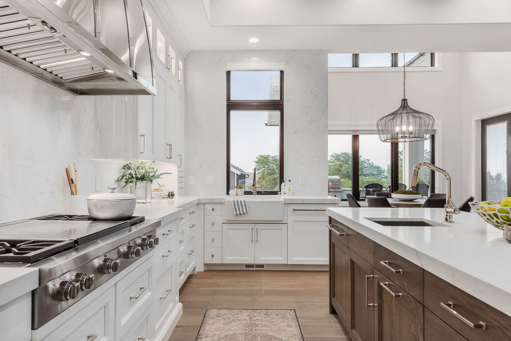
Double islands are continuing to be a popular trend, and this was our first time designing one – and boy were we were up for the challenge. We love the waterfall design we selected that makes the second island feel unique and grand for everyday use. Both can serve as countertops for cooking, serving, or eating, and they help break up the space while, you guessed it — still being functional. Perhaps our favorite feature in the kitchen is this custom hood! We added a little space on each side to give it the attention it deserves.
We LOVE an excellent pendant light. Here we used two 22-inch modern-looking pendant lights above this island. When in doubt with lights, we recommend going bigger – especially when working with a large space. There is nothing worse than having a light fixture that is too small for the area.
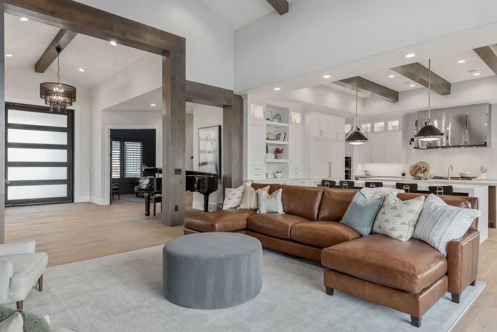
As if this great room/kitchen combo isn’t enough, check out this piano just right off the great room. It was part of the entryway and not its own separate room. It’s hard to see in the picture, but we created a custom painting for a focal point. We love how things flow from the entry to the great room and kitchen. This area of the home is perfect for hosting and entertaining. Party at this house, what do you say? You bring the piano man, and we’ll bring the charcuterie board.
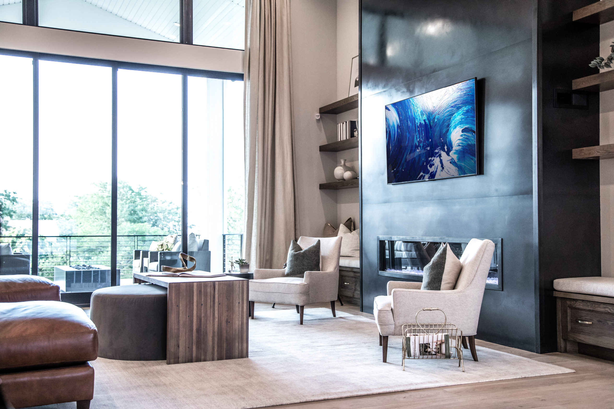
The Great Room was so tall and grand that we went with a floor-to-ceiling drapery panel window treatment. This helped to eliminate echo, add texture and keep a softness to the space. As to be expected by our design team, we made sure that they were not only beautiful but also functional. These elegant curtains were created to help control the bright morning or evening sunlight. Open them up to bring in the natural light and close them when you want some privacy. We chose tone-on-tone linen, so they don’t draw too much attention. We wanted the focal point of the room to remain on this stunning modern fireplace. Can you imagine sitting by the fire in those dreamy chairs, watching the sunset while sipping on some tea? Um… yes, please!
Speaking of seating, we added seating on both sides of the fireplace to create a corner for conversations at a party or gathering. The room’s layout was a unique shape so we made this double coffee table ottoman so it could be pulled up to the comfortable sofa, all while keeping the accent chairs feeling like a part of the seating arrangement.

